The MoniteProvider wrapper
The MoniteProvider is the root component that must wrap all other Monite-connected components. The wrapper provides extra configuration for all Monite components beneath it.
First, create an object with the parameters as shown:
| Property | Type | Description |
|---|---|---|
apiUrl | string | The URL for the API in use. |
entityId | string | The Monite entity to which the entity user belongs. |
fetchToken | function | A custom function that returns authorization tokens for authenticating subsequent requests |
MoniteProvider wrapper as shown:
The Dialog component
The Dialog component is a wrapper component that wraps Monite React SDK components. The component provides configuration for all Monite SDK components under it. The Dialog component has three props—open, fullScreen and alignDialog—that determine the availability and alignment of its child component(s).
When the open prop is true, the React SDK component(s) beneath the Dialog wrapper is rendered as a modal and aligned to the center of the page by default. The alignDialog prop is used to align the component modal to the left or right-hand side. Alternatively, using the fullScreen prop renders the component in a full-screen layout.
| Props | Type | Description |
|---|---|---|
alignDialog | ("left"|"right") | This prop determines the alignment of the component. If undefined, the child component(s) of the Dialog wrapper is aligned to the center of the page. |
fullScreen | boolean | When used, the child component of the Dialog components are rendered as a full screen. This prop must not be used together with the alignDialog prop. |
open | boolean | This prop determines whether or not the Dialog wrapper’s child component is rendered. If set to false, the Dialog is closed and components beneath the Dialog component will not be rendered. |
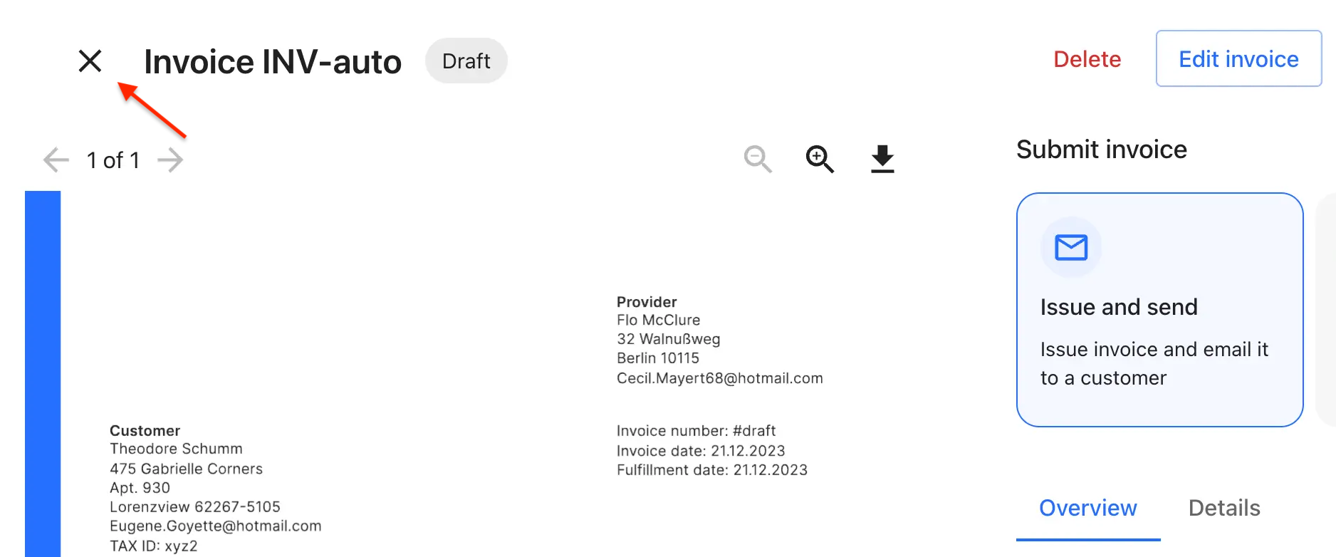
The IconWrapper component
The IconWrapper component is wrapper that allows you to customize the closing button of SDK screens. It includes:
- Compatibility with Material UI theming.
- Accessibility features, such as customizable
aria-label. - Optional tooltips for additional context.
- Dynamic icon swapping on hover.
- Integration of custom event handlers (onClick, onHover).
IconWrapper component as shown:
IconWrapper component properties and their description:
| Props | Type | Description |
|---|---|---|
icon. | object | A custom icon to be displayed, which can be any React node, SVG, image, or component. |
fallbackIcon | object | A fallback icon used when icon is not provided. |
tooltip | string | Tooltip text displayed on hover. |
color | ("inherit"| "default"| "primary"| "secondary"| "error"| "info"| "success"| "warning") | Icon color, using MUI theme colors. It defaults to ‘default’. |
onClick | function | Triggered when button click. |
onHover | function | Triggered for hover events. |
isDynamic | boolean | Determines if icon changes on hover. |
ariaLabelOverride | string | Custom aria-label for screen readers, defaults based on icon. |
sx | object | MUI system properties for custom styling. |