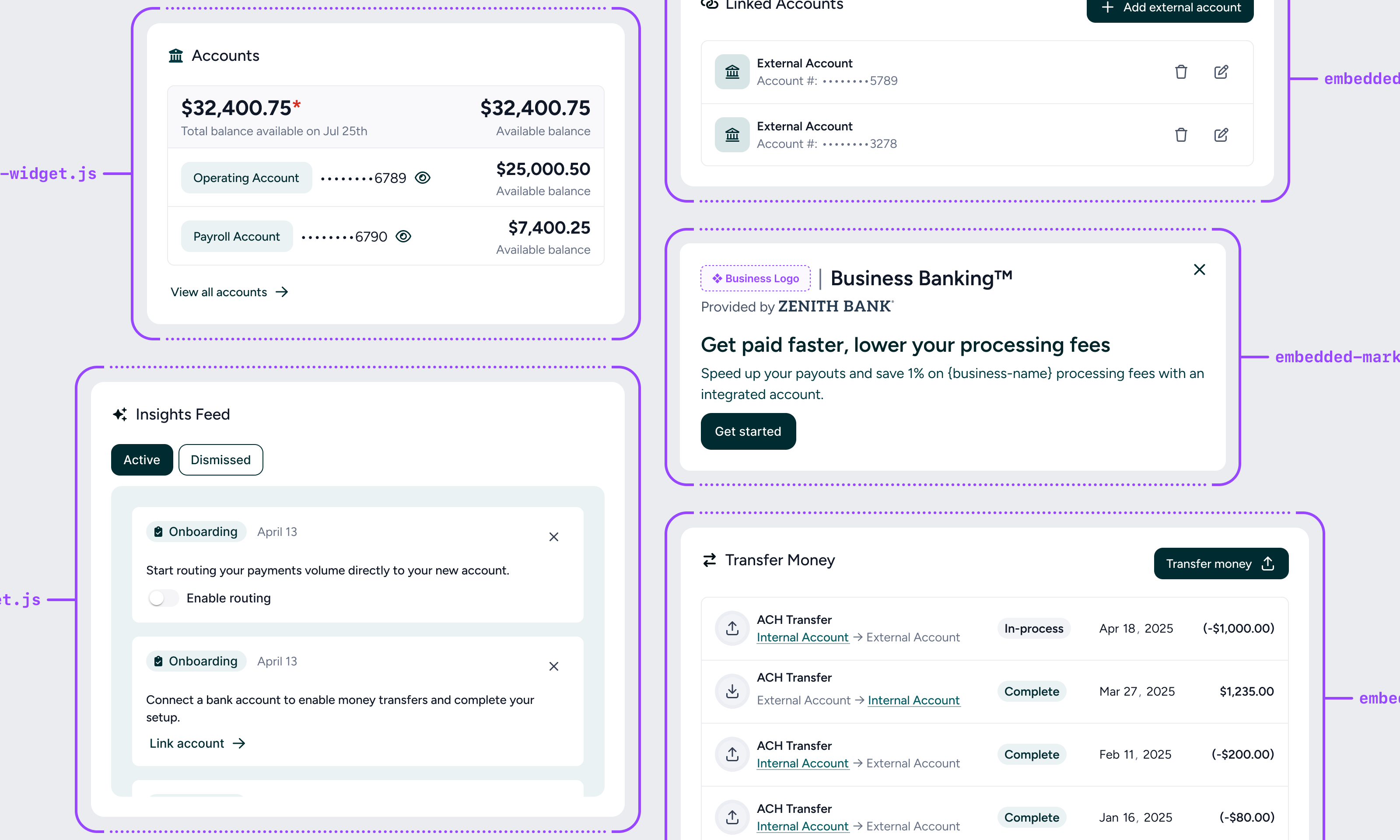
Widget catalog
| Widget | Description |
|---|---|
| Onboarding widget | Shows users marketing information about the embedded account, and kicks off the onboarding flow |
| Balances widget | Shows a business’s list of accounts and balances |
| Accounts widget | Allows a business to browse bank accounts and view or download a specific account’s transactions, statements and detailed information |
| Insights feed widget | Surfaces important tasks and notifications for users to act on |
| Link account widget | Allows users to securely link external bank accounts to transfer money to and from |
| Transfers widget | Allows money to be transferred between (to/from) embedded bank accounts and externally linked accounts |
| Settings widget | Allows user to view details about their account, update team settings, and get help via the FAQ |
Calling widgets
-
Load the widgets in the
<head>tag of your web app -
Drop them into your app wherever you’d like, making sure to pass in the following 2 values to facilitate Tesouro’s tracking of customers
- Merchant ID - This is your unique identifier for a business using your platform. Tesouro will store this to be able to differentiate new and existing business customers.
- User ID - This is your unique identifier for a human user of your platform. Tesouro will store this to be able to differentiate new and existing users.
-
Customize however you’d like
Tesouro’s widgets will default to the font style from your platform (using the inherit CSS keyword), and will default all other styles to what you see in this documentation. You are able to customize the look and feel to match your software platform more closely by passing in a variety of parameters as shown below:
Parameter Example Primary Color data-primary-color="#d1e0ff"Font style data-font-family="Verdana"Font color data-font-color="#151e32"Font Contrast Color data-contrast-text-color="purple"Hyperlink color data-hyperlink-color="#1a5eea"Rounded corner radius data-modal-border-radius="0"Button color data-button-color="#1a5eea"Button corner radius data-button-border-radius="10px"Widget Background color data-widget-background-color="#d1e0ff"Widget Border radius data-widget-border-radius="10px"Modal Background color data-modal-background-color="#d1e0ff"